Typography
Identity
Why I draw type before I draw logos
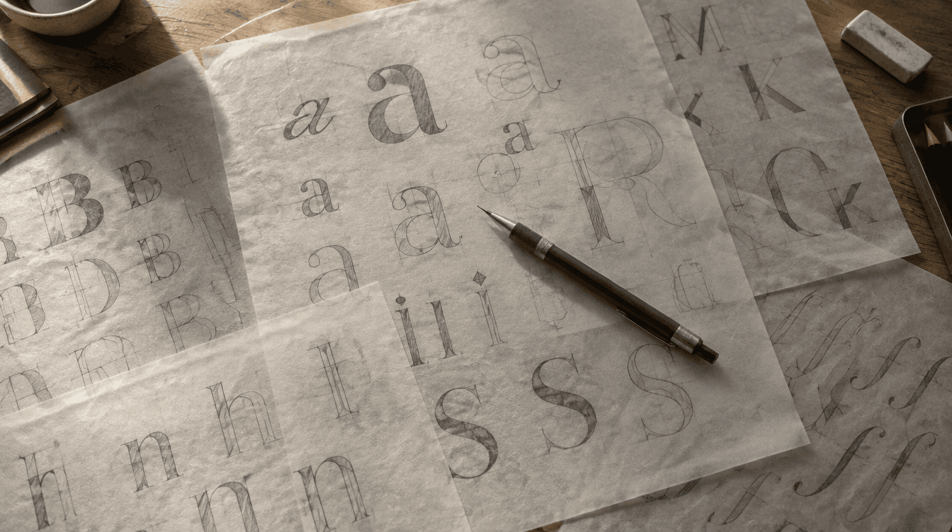
A logo is one drawing. A typeface is a system of decisions that will govern several hundred drawings you have not made yet. If you settle the second thing first, the first thing almost draws itself.
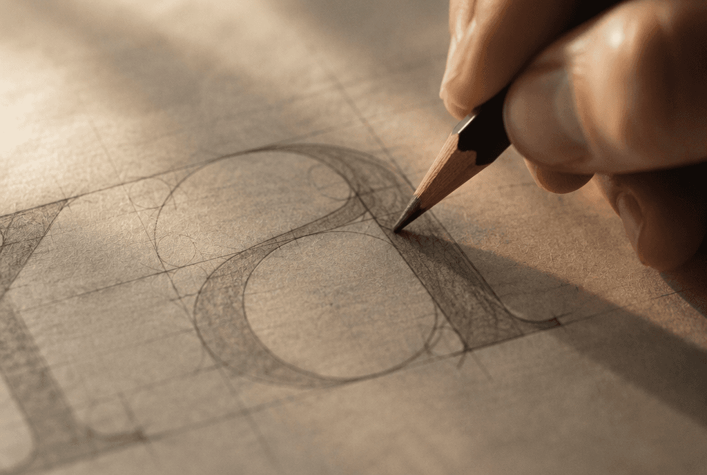
The mark inherits the alphabet
When I start with the wordmark, I am choosing a weight, a contrast model, a terminal shape and a set of proportions. Those choices then have to be honoured by every headline, every caption, every button label in the system. If I design the mark in isolation I usually end up with something beautiful that nothing else in the brand can stand next to.
Working the other way round, I spend the first week drawing an alphabet — sometimes only twelve or fifteen characters, enough to establish the rules. The mark is then cut from that alphabet rather than bolted onto it.
What the twelve characters should be
Not A through L. You want the characters that force the hardest decisions: a lowercase a and g for construction, an o and n for width and rhythm, an s for the trickiest curve in the alphabet, a capital R for the leg, a 1 and a 4 for the numerals, and whatever letters happen to appear in the client’s name.
Those characters will tell you within a week whether the idea survives contact with real words. Most ideas do not. It is much cheaper to find that out with fifteen glyphs than with a finished identity.

When to buy instead of draw
Drawing a custom face is not always the answer and it is rarely the affordable one. But the exercise is worth doing even when the end result is a licensed typeface, because it tells you precisely what you are looking for. I have shortlisted foundry faces in an afternoon after a week of drawing, having spent the previous month failing to shortlist anything at all.
Previous article

Next article

Got a brand that deserves to be remembered?
I take on a limited number of projects each quarter so every one gets my full attention. Tell me what you’re building and let’s see if we’re a fit.


