Lumen Atelier
2025
Skincare
Brand strategy, Visual identity, Art direction, Packaging design
About work
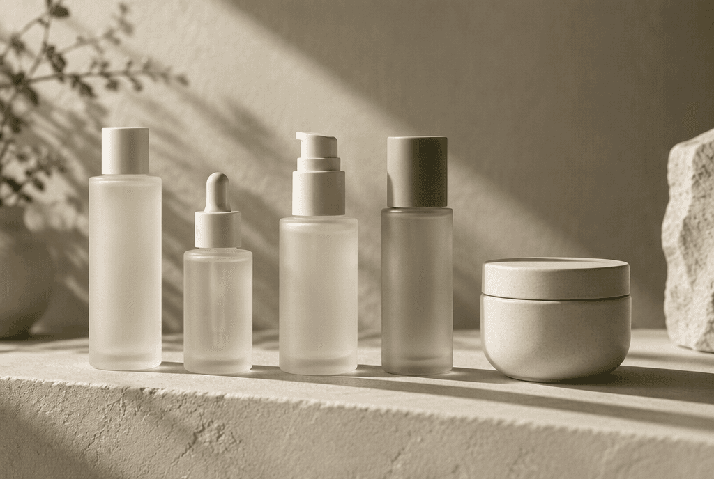
Lumen Atelier came to us with twelve formulations, a strong point of view and no way to say it out loud. The category was crowded with clinical white and sans-serif restraint, and everything they made felt warmer than that.
We rebuilt the brand around light as a material — how it falls, softens and reveals texture — and let that idea run through every surface from the bottle to the booking page.

Tools
Figma
Adobe Illustrator
Blender
Framer
The approach
We started with a two-week material study, photographing each formulation under changing daylight to find the palette rather than invent it.
The wordmark was drawn from scratch with an elongated lowercase ‘l’ that reads as a shaft of light. Secondary type stays quiet so the photography can carry the emotion.


The outcome
The rebrand launched alongside three new SKUs and sold through the first production run in nine days.
Direct traffic grew 140% quarter over quarter, and the identity has since been picked up by two retail stockists in Copenhagen and Lisbon.

Next work
Got a brand that deserves to be remembered?
I take on a limited number of projects each quarter so every one gets my full attention. Tell me what you’re building and let’s see if we’re a fit.


