Northbound Coffee
2025
Food & Beverage
Brand strategy, Visual identity, Signage, Editorial design
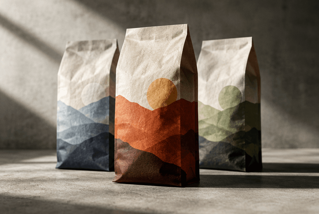
About work
Kindred runs eleven clinics in neighbourhoods where the nearest alternative is an emergency room. Trust is the whole product.
The previous identity borrowed heavily from hospital design language — blues, crosses, clinical distance — and it was quietly keeping people away.

Tools
Adobe Illustrator
InDesign
Figma
The approach
We replaced the clinical palette with warm clay and deep green, and drew a mark based on two hands rather than a cross.
Signage was designed to be read from across a street at night, in four languages, without translation feeling like an afterthought.


The outcome
First-visit registrations rose 26% across the network in twelve months.
The signage system has since been adopted by two partner clinics outside the group.
Previous work

Next work

Got a brand that deserves to be remembered?
I take on a limited number of projects each quarter so every one gets my full attention. Tell me what you’re building and let’s see if we’re a fit.


